
What If Your Data Could Tell Its Own Story? Inside the AI Agent That Brainstorms Visualizations For You
Imagine uploading a spreadsheet and getting back not just charts — but a strategic argument about which charts to build and why. This is the Generative Data Visualization Brainstormer.

Picture This
You've just been handed a spreadsheet. 4,000 rows. 22 columns. Revenue data, customer segments, product categories, regional breakdowns, monthly trends.
Your manager says: "Can you pull some insights from this for the board deck?"
You open Excel. You stare at column headers. You start building a bar chart because… that's what you always build. Then a pie chart, because someone on the board "likes pie charts." You spend three hours creating visuals that are technically correct but strategically empty.
The board deck looks polished. But did it answer the right questions? Did the visualizations reveal the insight that matters most? Or did you just dress up numbers?
Now imagine a different scenario.
You upload the same spreadsheet to an AI agent. In under two minutes, the agent responds — not with charts, but with a pitch:
"Based on the data shape and relationships I've identified, here are the 3 most strategically valuable ways to visualize this information, and why each one could change the board's decision."
The agent doesn't wait to be told what chart to build. It analyzes the data and proposes the best analytical path first. You choose the direction. Then it builds.
This is the Generative Data Visualization Brainstormer.
Let your data surprise you.
Download the Data Visualization Brainstormer TACT Blueprint.
Why "What Chart Should I Build?" Is the Wrong First Question
Most data visualization workflows follow a predictable sequence:
- Receive data
- Decide on a chart type
- Build it
- Present it
The problem is in Step 2. The chart type is usually chosen based on habit, not analysis. The result? Visualizations that display data without revealing insight.
The Brainstormer inverts this sequence:
- Receive data
- Profile the data — understand its shape, relationships, outliers, and distributions
- Ideate — propose the visualizations that would reveal the most strategic insight
- Let the user choose
- Build the selected visualization
The difference: the AI makes a case for each visualization before building anything. You don't just see numbers in chart form — you understand why that chart matters.
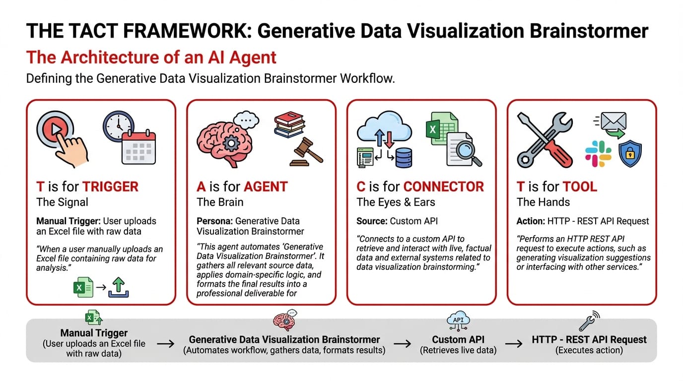
The TACT Architecture: Ideation-First Visualization
T — Trigger: Manual — Upload a Raw Data File
The user uploads an Excel file with raw data. No pre-processing needed. The agent handles the analysis from the raw source.
A — Agent: Generative Data Visualization Brainstormer (Knowledge Type)
The agent runs a three-stage ideation pipeline:
Stage 1 — The Data Profiler: Analyzes the spreadsheet's structure:
- How many dimensions does the data have?
- Are there time-series patterns?
- What are the key categorical groupings?
- Where are the outliers and anomalies?
- What correlations exist between columns?
Stage 2 — The Ideation Agent: Based on the profiling results, the agent generates 3 visualization proposals — each with a strategic rationale:
- Proposal A: The visualization that tells the trend story (how things are changing)
- Proposal B: The visualization that tells the comparison story (what's outperforming what)
- Proposal C: The visualization that tells the anomaly story (what's unexpected)
Each proposal includes: the recommended chart type, which data columns to use, and — critically — what business question the visualization answers.
Stage 3 — The Chart Generator: After the user selects their preferred proposal (or asks for all three), the agent builds the visualization.
System Prompt:
You are a Generative Data Visualization Brainstormer. Your workflow:
- Collect Input Data: Gather all relevant source data, documents, and information.
- Consolidate & Structure: Organize and standardize the collected data.
- Analyze & Process: Exercise autonomy in ideation. Don't wait to be told what chart to build; analyze the data and propose the best analytical path first.
- Validate Results: Review the processed output for accuracy.
- Distribute Output: Format the final results and share with stakeholders.
C — Connector & T — Tool
| Component | Detail |
|---|---|
| Connector: Custom API | Connects to internal systems for data retrieval |
| Tool: HTTP – REST API Request | Interfaces with visualization libraries and data processing services |
Sample Interaction: The Brainstorm in Action
User uploads: Q4_2025_Sales_Performance.xlsx (4,200 rows, 22 columns)
Agent Response:
Data Profile Summary:
- 4,200 transactions across 5 regions, 12 product categories, 8 months
- Revenue range: $120 – $45,000 per transaction
- Notable outlier cluster in APAC region Months 6-8
- Strong negative correlation (-0.72) between discount percentage and customer retention rate
Visualization Proposal A: The Trend Story
- Chart Type: Multi-line time series with confidence bands
- Axes: Monthly revenue by region (5 lines)
- Question Answered: "Which regions are accelerating and which are plateauing?"
- Why This Matters: APAC shows an unusual spike in Months 6-8 that diverges from historical trend. This could indicate a successful campaign — or a data quality issue. The board needs to see this divergence.
Visualization Proposal B: The Comparison Story
- Chart Type: Stacked waterfall chart
- Data: Revenue contribution by product category, sorted by margin contribution
- Question Answered: "Which product categories drive revenue vs. which drive profit?"
- Why This Matters: Two categories (Electronics and Industrial) drive 60% of revenue but only 35% of profit margin. This gap is invisible in a standard bar chart.
Visualization Proposal C: The Anomaly Story
- Chart Type: Scatter plot with regression line and outlier highlights
- Axes: Discount percentage (X) vs. 6-month customer retention rate (Y)
- Question Answered: "Are our discounts actually hurting customer loyalty?"
- Why This Matters: The -0.72 correlation suggests higher discounts correlate with lower retention. This could challenge the current discounting strategy.
Which would you like me to generate? (Select one, or all three.)
The Creative Difference
Traditional BI tools (Power BI, Tableau) are powerful — but they're authoring tools. They do what you tell them. They don't tell you what to do.
The Brainstormer acts as a creative data consultant. Before any chart is drawn, it performs the analytical thinking that most people skip. It's the difference between data display and data discovery.
Your board deck doesn't need more charts. It needs the right charts — the ones that surface the insight no one was looking for.
Your data has a story. Let an agent find it.